Concept maps for massive.wiki
Many thinking tools provide a graphical map of the users' notes, either off the shelf or via plug-ins. These maps, however, won't currently appear on the web-facing version of a massive.wiki. Should they, and if so what features would we like to see?
(This post is massively incomplete. Please dont let that stop you contributing, as I take permanent version snapshots reasonably regularly (see Revision notes).
A few months ago Jerry Michalski recommended Steven Pinker's book The Better Angels of Our Nature: Why Violence Has Declined to me. It's huge, covering 1000s of years of human history in almost 850 dense pages, followed by 60 pages of notes, another 60 of references and a 50-page index.
I found myself regretting, as I finished it, that I hadn't read it with my laptop alongside me, making notes as I go. There are just so many ideas in it, each supported by a web of data, scientific papers and other ideas, that it's impossible to hold all of it in my head. The book's notes, references and index are useful, but they're locked away in my bookshelf, not here where I need them in my notes, let alone sharable with others.
So it got me thinking: if I was to note what I found in a book like Pinker's, could I organise and present those notes graphically to help me get the most out of them? And how could I share, discuss and compare this map with other people, given that Pinker's book has generated plenty of opposing challenges and critiques?
In parallel, I wanted to draw up a "maturity heatmap" of the minimum viable ecosystem for decentralised collective intelligence. Could a graphical map of notes do the trick?
This post sets out some ideas of how that could look. While I'm not clever enough to then provide solutions, later versions of this post will hopefully include some first attempts to play with Obsidian's graph view and Juggl. For now, I just want to visualise the idea to stimulate ideas from people cleverer than me.
Caveat: I already know that what I'm describing below are not "concept maps" (a term I'm using very loosely), and that I'm describing very limited applications of powerful technologies (eg RDF triples) which are not entering the consumer mainstream anytime soon.
More than a list of notes
Let's start with mapping notes from Pinker's book.
For those who haven't read it, the book is not a mere enumeration of ideas and their supporting facts: it provides a structure of interlocking ideas to explain downward trends in the level of violence over the past centuries . Paraphrasing Wikipedia's summary, he sets out what I'll call here 15 high-level ideas:
- Six trends of declining violence, from the Pacification Process (from the anarchy of hunter-gatherer and horticultural societies to the first agricultural civilizations) through to the Rights Revolutions since the end of WWII
- Five inner demons: psychological systems from Predatory violence through to Ideology
- Four better angels, which despite being outnumbered seem to have gained the upper hand: Empathy, Self-control, Moral sense and Reason.
Each trend gets its own chapter, while the demons and angels account for two more. Each idea moreover, is supported by a lot of data, both directly presented within the book and via cited academic papers.
Crucially, some data supports several ideas, while occasionally he'll mention data which supports some ideas but seems to oppose other ideas. Science is like that.
Current graph view
Users of Obsidian know that, unlike Roam Research, it comes with a pretty useful graph view - here's a snapshot of a graph of the notes in this massive.wiki, taken as I write version 2 of this post:
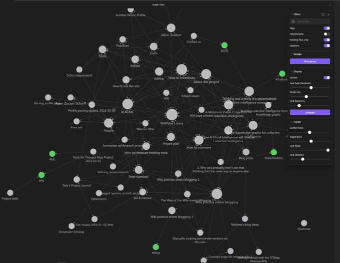
Obsidian's graph view presents each note as a node, bidirectionally linked, with node size representing the number of incoming links, and is filterable as shown.
However a really good set of notes from such a book would reflect the above ideas and the actual (sub)chapter structure of the book itself.
Idea/Fact maps
Ideas, Facts and the relationships between them
For example, something like this:
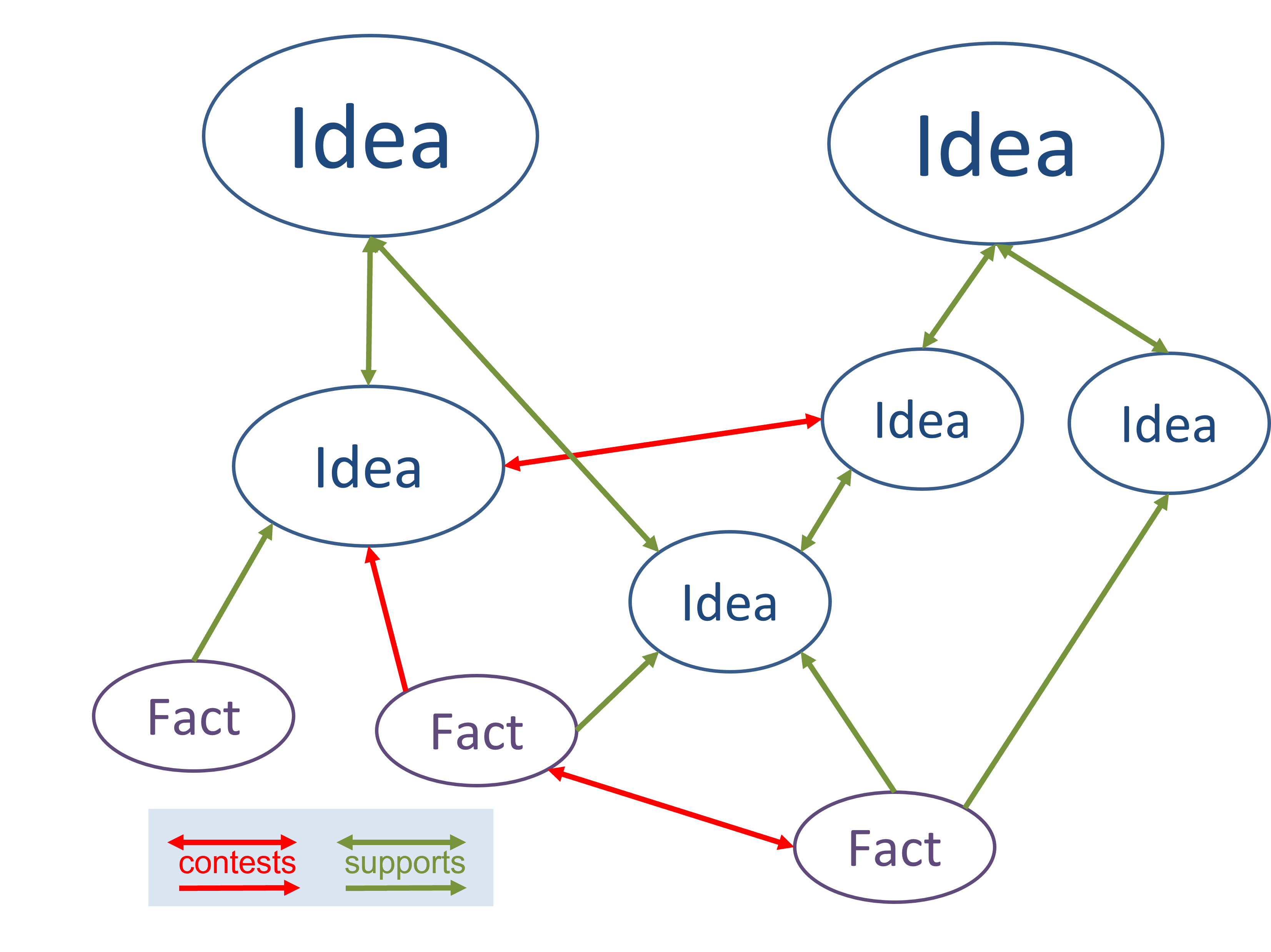
In the above picture, each note is a node, as before. However:
- some notes have been identified as Ideas, others as Facts
- the links between them are characterised as Supporting or Contesting - ie
- an Idea can Support (green) or Contest (red) another Idea
- a Fact can Support or Contest an Idea
- a Fact can Support or Contest other Facts
The graph shows some links as single-headed and others as double-headed arrows, to avoid an Ideas appearing to Support a Fact. This does not mean that a user exploring an Idea would not see the Facts supporting or contesting it.
Such a map would ideally emerge from one's notes as a force-directed graph of nodes simply by labelling notes as either Idea or Fact, and including some semantic information (Support/Contest) on the links between them.
While that would be totally automated, however, it might also be useful to be able to "boost" or reposition specific nodes.
Filters not shown
You would, of course, be able to filter the above map using any of the book's 15 overarching ideas. Not shown in the above figure, however, are all the other filters you could employ:
- You should be able to filter by type: Idea or Fact
- Each node would have subject tags, allowing you to filter with greater granularity than Pinker's 15 overarching ideas.
- Source: a source tag in each note indicates where it came from. When the source is a book like Better Angels, this could be a multi-level taxonomy, encompassing book, chapter and subChapter - for example:
- level 1: The Better Angels of Our Nature
- level 2: A Foreign Country
- level 3: Human prehistory
- level 3: Homeric Greece
- ...
- level 2: The Pacification Process
- level 3: The Logic of Violence
- ...
- level 2: A Foreign Country
- level 1: The Better Angels of Our Nature
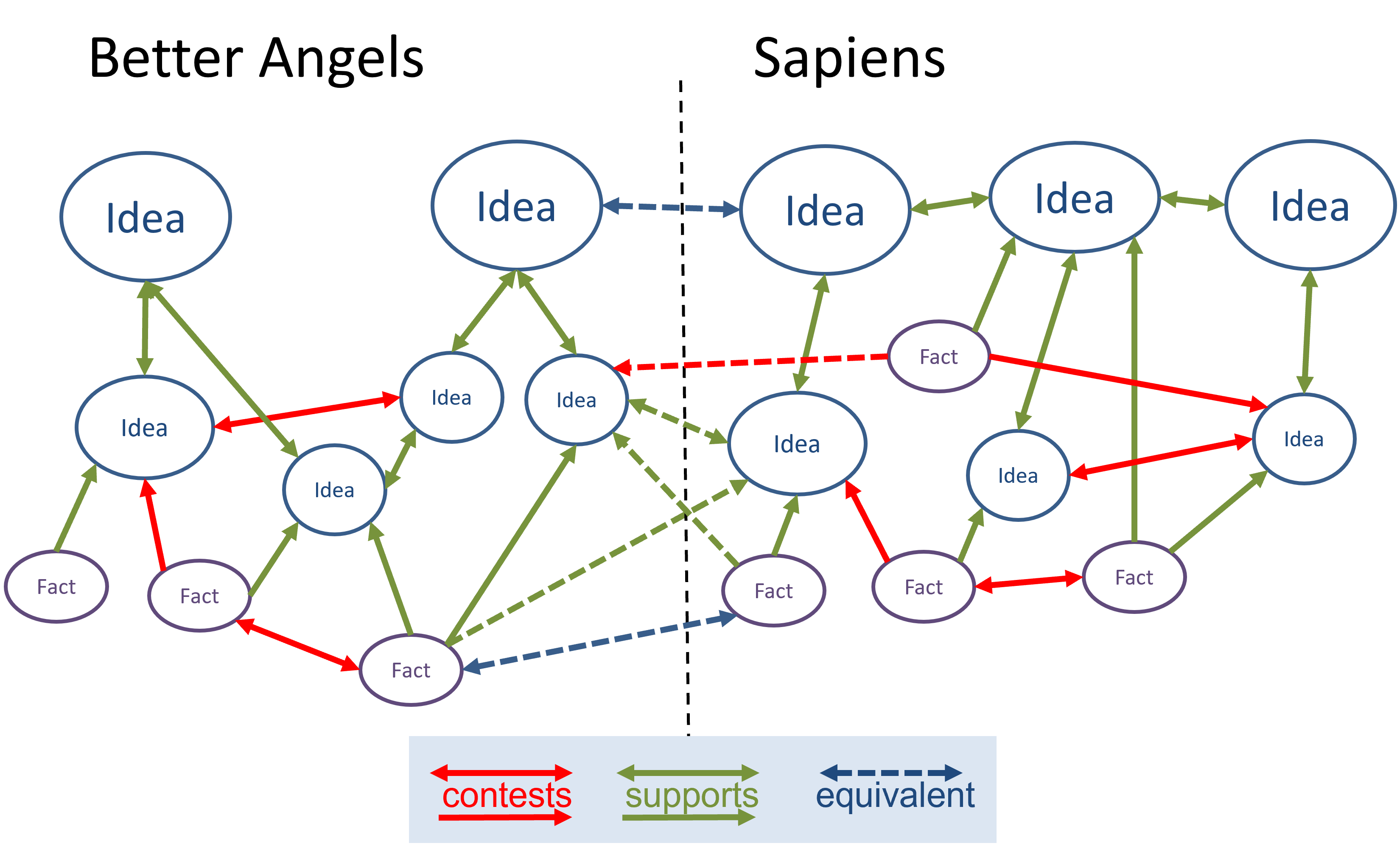
Linking ideas and facts across books ...
Source tags means a map of Steven Pinker's book is simply a filtered view of all of your notes interlinked in this way.
And that, of course, means that rather than have a separate map for each book, I could have a map encompassing all the Ideas and Facts I've identified from both "Better Angels" and the book I read next: Yuval Noah Harrari's Sapiens, which also examines the evolution and history of our species and culture. All I'd need to do is filter my global map by "Better Angels" and "Sapiens" source tags, combined with an "OR" operator.
And that, in turn, would allow me to add Support/Contest links between the Ideas and Facts from different sources. This would probably also require an "Equivalent" relationship, for when Ideas or Facts from different Sources turn out to be the same:
... and across communities: going social
What happens when this goes Multiplayer?
A community collaborating on a set of notes should see exactly the same behaviour as an individual, but it gets more interesting when maps developed separately are combined and compared.
Imagine two communities developing two different maps on the same underlying Source material. Then imagine an ecosystem which allows these maps to be discovered, linked, contrasted, compared and possibly even combined. How might that look?
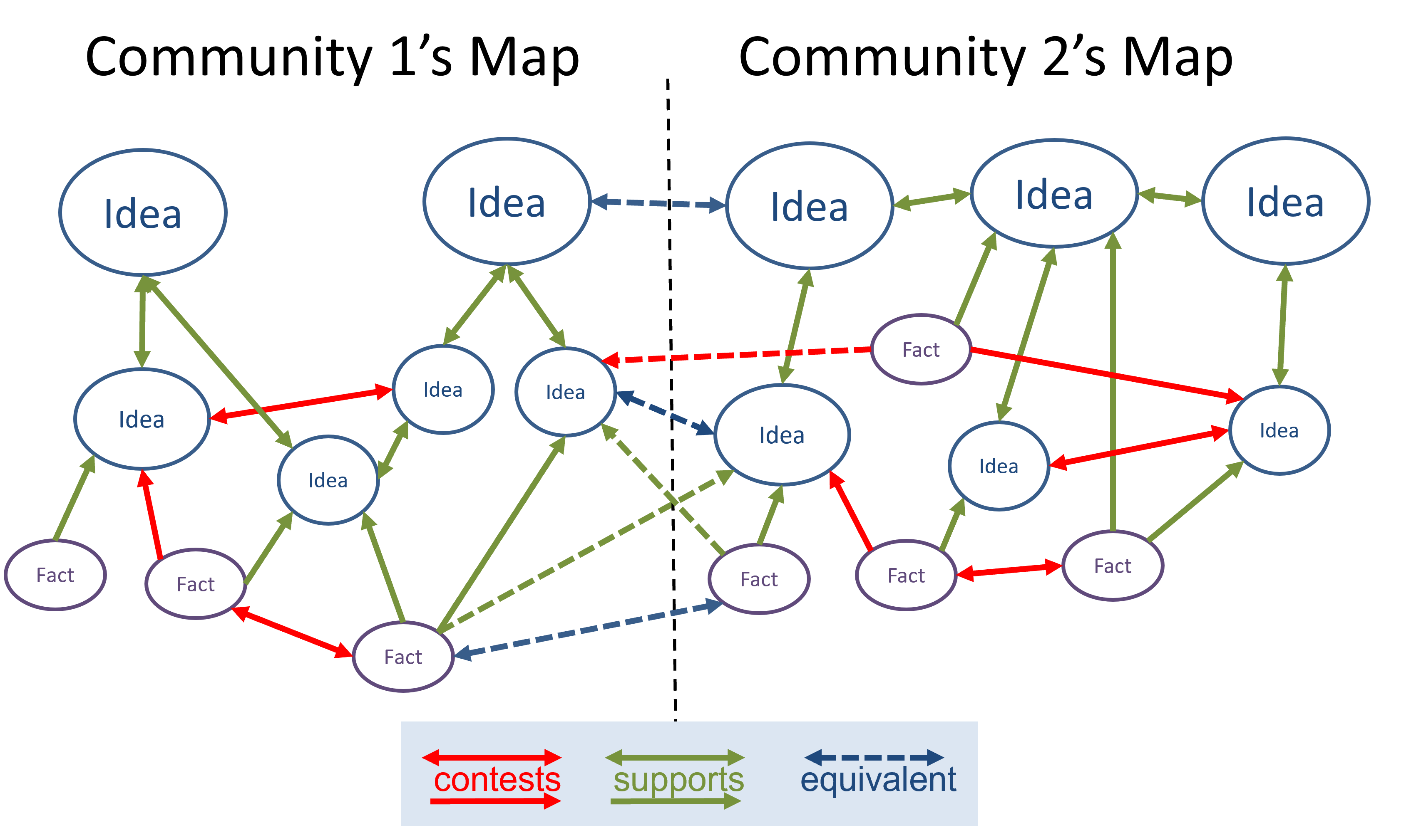 It turns out that it looks more or less identical to the previous image, except that instead of adding Support, Contest and Equivalent links between Ideas and Facts in different sources, you're doing so between different communites' maps.
And those maps can actually be based on the same or different source material: the underlying tools would be identical.
Heatmaps: further layers of information
Could the same maps have "heatmap overlays"?
Characterising the above relationships in such a trinary fashion (Supports, Contests or Equivalent) lacks a lot of nuance. Sometimes you may want to add a qualifier, like "somewhat Supports" or "roughly Equivalent".
Maybe we could add this an extra layer of information using heatmaps - each heatmap is an overlay sitting semi-transparently "above" an existing image, adding further dimensions of information.
I, for example, would love to see a "maturity heatmap" showing the technical/market maturity of the various technologies required for the minimum viable ecosystem for decentralised collective intelligence, which would show me at a glance exactly where resources need to be focused.
And then I'd love to see an array of such heatmaps, allowing me to see at a glance which ecosystem is closest to maturity.
The maps explored above could also include heatmaps by adding to each node a value for each overlay (eg something like maturity::4). These values could even be calculated from the nodes linked to it, somewhat similar to the way the spidergraph in this massive.wiki (will) present average scores for each tool for thought, calculated from the profiles of the people using it.
Solutions
This section to be done in a future version. Contributions welcome
Obsidian graph view (available)
What I can get from Obsidian graph view: limited to Obsidian users, invisible to website visitors
Juggl (available)
Playing wth Juggl. Same issues as Obsidian graph view? tbc
d3 (open source)
Could a tool be developed which could generate a d3.js file from any set of compatible markdown files, created using any thinking tool? Such a file could be integrated by the thinking tool and displayed on public sites.
Revision Notes
^668be5
- developed and added images, in the process making substantial edits
- version control (see Wiki practice meets blogging)
- this is version: current
- here is the current version: Concept maps for massive wiki
- previous version: Concept maps for massive wiki 2 - 2023-04-07